
During summer I spent a short amount of time thinking about how I wanted my design presence and I came up with the name Mt. Everitt. It's a play on words of Mt. Everest, and is a name that has been often used towards me when I tell some people my second name ("What like, Mt. Everitt?" "...Yes..."). Although quite silly, I believe its memorable, and quite different, as a lot of desginers just use their full names. The idea is that my name looks as if its the name of a mountain, which gives the user a sense of something great, or something powerful.
I originally liked the idea of having my name drawn by hand, so I tried sketching out a few ideas:

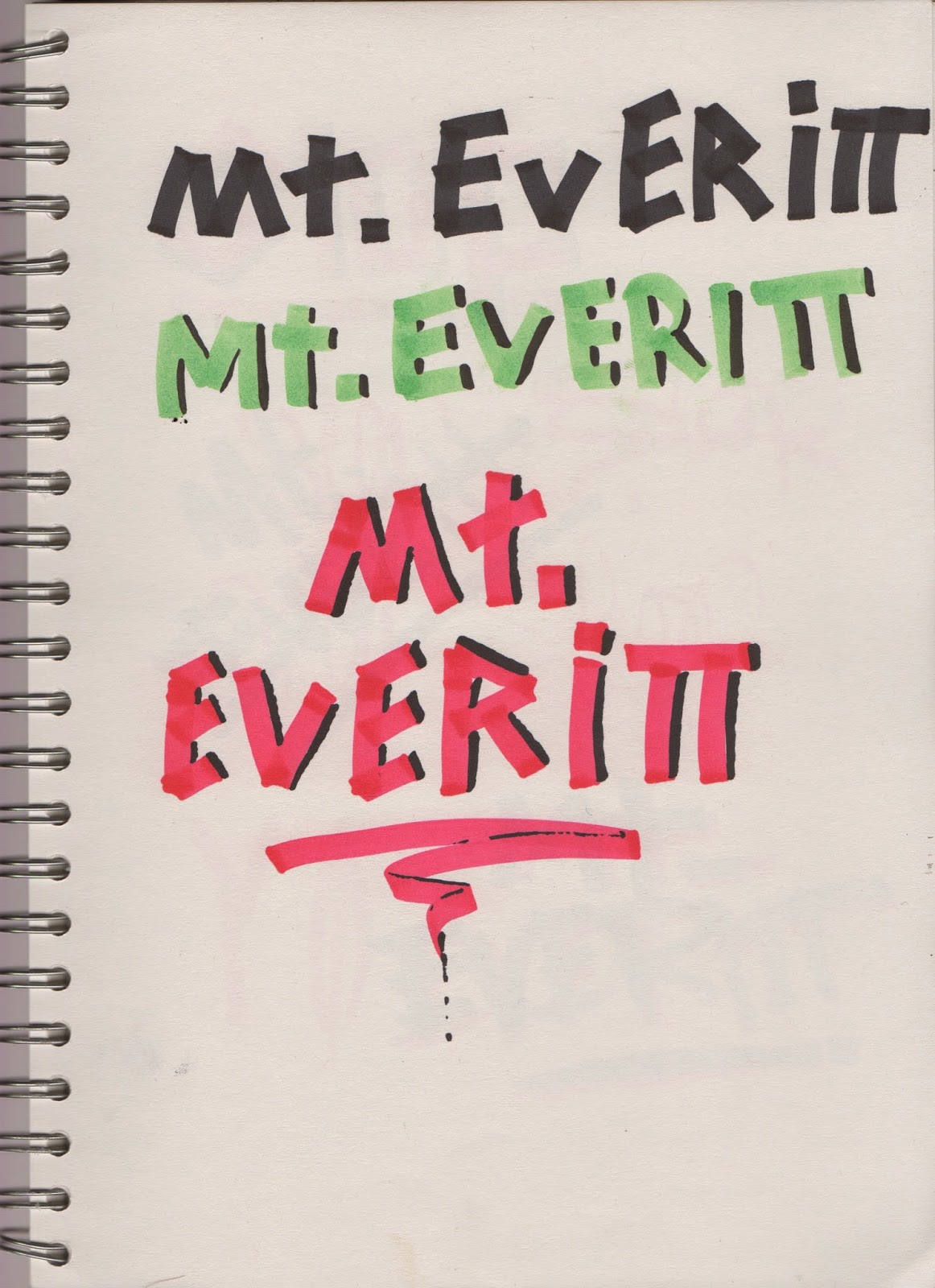

After drawing out a few ideas, I came to the conclusion that I wanted my name to be quite bold but symmetrical, and decided that using a specific type face would give me a much more professional and quality feel to my identity.
I chose a font that was bold and would give more emphasis on the power of the name.

I sharpened off the edges of the letters, and cut down the I to make fit more appropriately with the rest of the type.

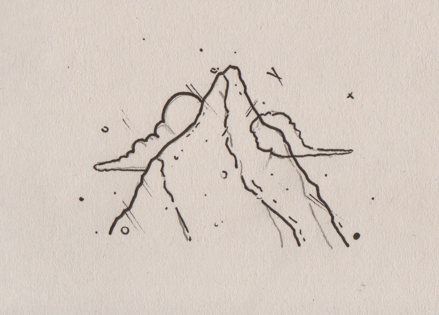
I then came up with the idea of changing the spikes of the M into a mountain, which would also be able to used as a logo.


I played around with the negative space inside the mountain, but it didn't work with the clean design of the font.


I took the name I liked and applied it to different colours to see what it looked like, I also applied it to some business cards


Whilst designing the business cards I thought about how i'd prefer it if someone gave me theirs, and I always feel like business cards are quite big. I decided that I would have my business cards small and long instead of being the normal size. As well as being small and easy to pick up and put in your pocket, the size also makes it stand out from other business cards and creates a sort of unique style.


I decided to change the font completely into a serif font. It's still bold but just adds a bit more formality and sophistication to the logo, making it come across a lot more professional. I used a font called GrandeeCP, but edited it so it was more suitable for me.
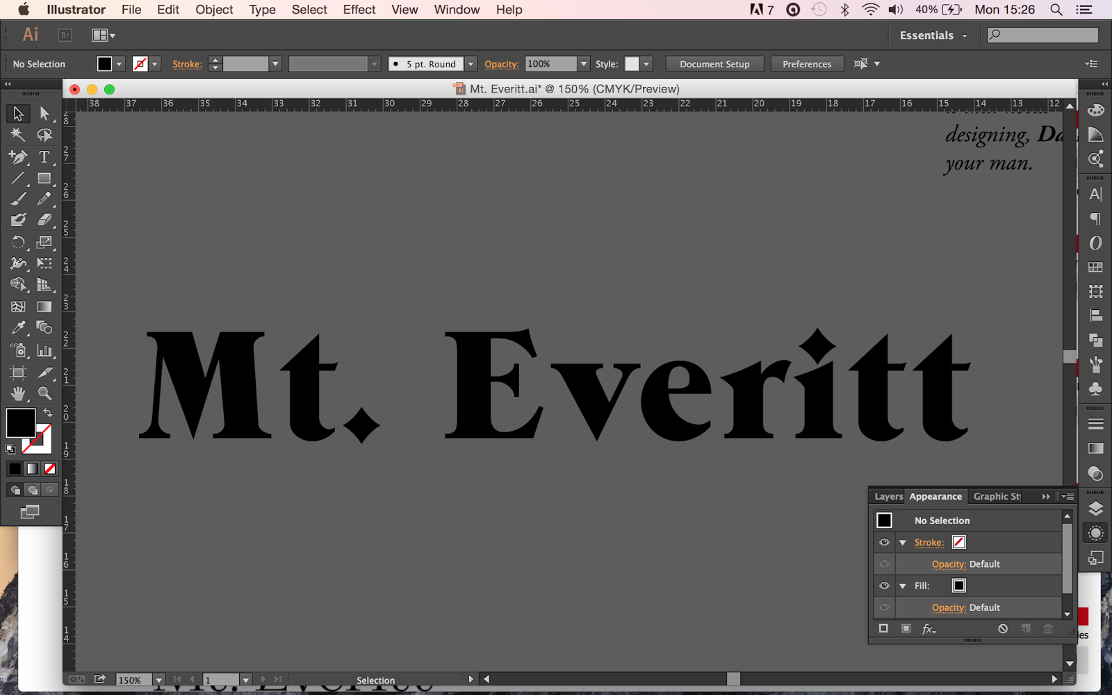

As you can see I changed the diamonds, which were used as dots into circles. I also changed the heads in the T's from being quite sharp to being flat. And I changed the serifs from being squared off to being pointed. I wanted the font to be more rounded and friendly, rather than quite harsh and sharp.


I then created a logo, which consisted of the V being flipped around, which create a mountain with a tree, and then also out of that I drew the end of a pencil, which also looked like a mountain. I added an extra tree, and blended these together and came up with this logo:


Here is my final business card. When I come to print the actual thing I want the stock to be a nice grainy matte, with the Mt. Everitt embossed. I also want the edges of the business card to be black.


No comments:
Post a Comment